
 It seems there is another marketing infographic hiding around every corner of the web, and it will probably fall well short of its potential.
Instead of making information easier to consume, many infographics make it harder to understand the information they present or even outright mislead.
Here are 5 of the biggest infographic mistakes marketers make with an example of each.
1. Creating Confusion Instead of Clarity
Even as a gardener, this infographic was very difficult to follow for me. In particular, look at the environment key below and map that information in the infographic.
Beyond being hard to read, it can even mislead. Because it specifies planting times and average weather but for where? Every climate is different and the climate will impact planting times, temperatures, harvest, etc.

Source: http://visual.ly/potato-lifecycle
2. Misrepresenting Information
Nielsen recently presented their research in an infographic-like format. In making the headlines catchy, they actually became inaccurate.
Under Race/Ethnicity, the heading reads “She is likely Asian or Pacific Islander.” However, that simply is not true.
The Asian and Pacific Islander segment is more likely to use social media than any other race or ethnic segment broken out in the report. However, it is also a relatively small segment. The most likely segment is the largest one, not the one with the highest index.

Source: http://memeburn.com/wp-content/uploads/nielsen-social-media-report.pdf
3. Not Sourcing Statistics
Just because it is on the internet does not mean it is true. Infographics, without a good way to embed full links to sources, are particularly poor at including sources. Many simply link to a main page, leaving you to search for the actual source used.
This example goes a step further, completely ignoring any attempt to include sources.

Source: http://visual.ly/lets-do-price-warp
4. Too Much Text
Infographics should use visual design to quickly and clearly make a point. If your infographic has more text than the average blog post, you have missed the whole point of infographics.
This example from KISSmetrics is particularly disappointing. There is good information and advice buried in the infographic, but even where it was originally published most of the text is so small that it is unreadable on a large screen, forget about trying to read it on a mobile.
The information could have been presented as a blog post or redesigned with significantly less text.
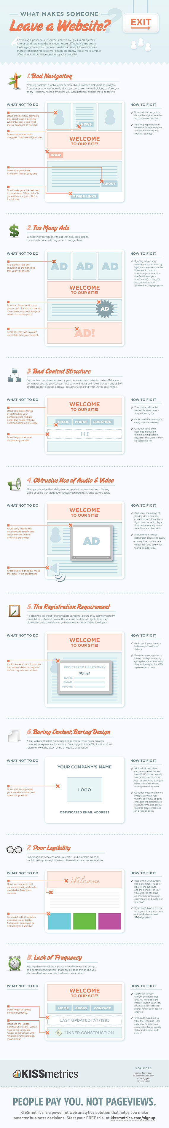
Source: What Makes Someone Leave A Website?
5. Just Desperate for Content
Coming up with ideas for content is a challenge, but that is no excuse for actually moving ahead with a content idea that simply adds to the content clutter we are all already facing. If it isn’t informative, useful or entertaining, just stop.
In addition to having no real reason to exist, this infographic from Lawyers.com is heavy on text and the design doesn’t help it to communicate the point it doesn’t have.

Source: http://blogs.lawyers.com/2012/01/how-to-stay-out-of-jail-on-super-bowl-sunday/
Your Turn
What other mistakes do marketers make with infographics? Share your views, or even links to the worst offenders, in the comments below or with me on Twitter (@wittlake).
Pingback: Five Biggest Infographic Mistakes Marketers Make | Tocquigny's Digital Marketing Daily | Scoop.it()
Pingback: The rise of the Infographic Case Study | referenceacademy()
Pingback: Sourcing3 Buyer & Supplier Magazine - Best of B2B Marketing Zone for Week of August 11, 2012()
Pingback: Sourcing3 Buyer & Supplier Magazine - Best of B2B Marketing Zone for August, 2012()
Pingback: Sourcing3 Buyer & Supplier Magazine - Best of B2B Marketing Zone for August, 2012()
Pingback: 4 out of 5 Marketers are Zombies! [Infographic] — B2B Digital Marketing()
Pingback: The rise of the Infographic Case Study |()